Design Inspiration with VOLA
VOLA: The Original – bringing color to the design industry since 1968.
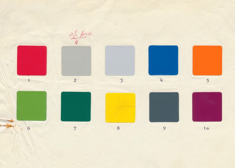
In 1968, when Arne Jacobsen designed what was to become the now iconic VOLA faucet, he knew that through material and color he had the power not only to design but to define a whole atmosphere. His first foray into the world of color for VOLA was with orange and grey colors in which early prototypes were crafted. He favored the grey colors inspired by the tone of concrete; the muted grey pigment is now a timeless classic for any interior scheme. The first commercial installation of VOLA was in the National Bank of Denmark in 1970 and the finish was 02 Grey, still in the current color palette we have today.
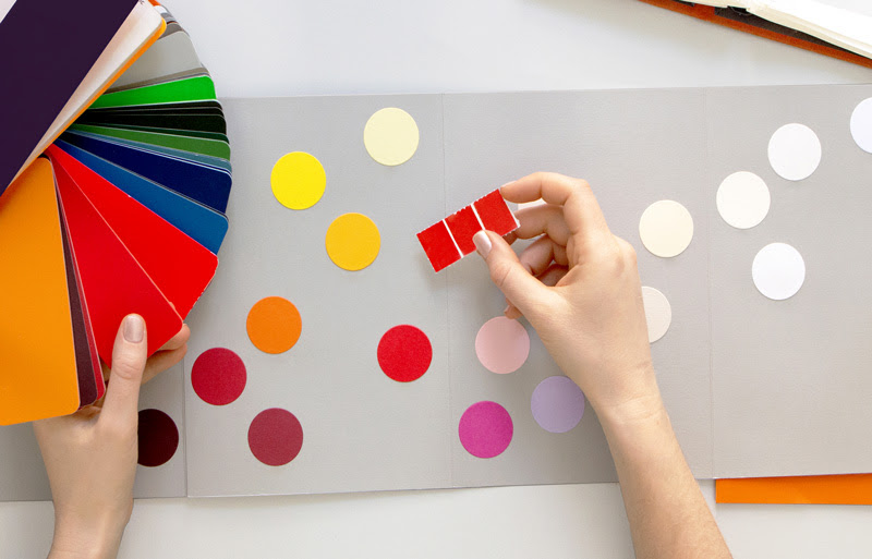
After realizing that colorful faucets could form an essential part of a scheme and help create characterful spaces, in 1970, VOLA selected 10 expressive hues. These injected personality into its range of kitchen and bathroom fixtures and for the first time, bathrooms and kitchens were new arenas for personal expression.
Today, the 10 original shades have evolved into a palette of 15 colors, six of which are still featured from the original 10, and matte white being the most recent addition. These are still integral to VOLA’s design identity, with each hue bringing the ability to shape the spirit of a space. Even in a world of mass production, every single product configuration, of which there are approximately 100,000 possible combinations, is available in each of the 15 colors – colored by hand in Horsens, Denmark, where every product is built to order.
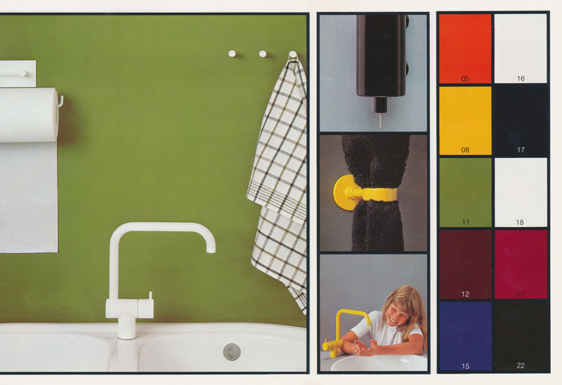
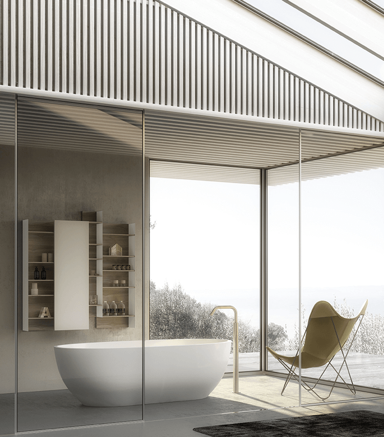
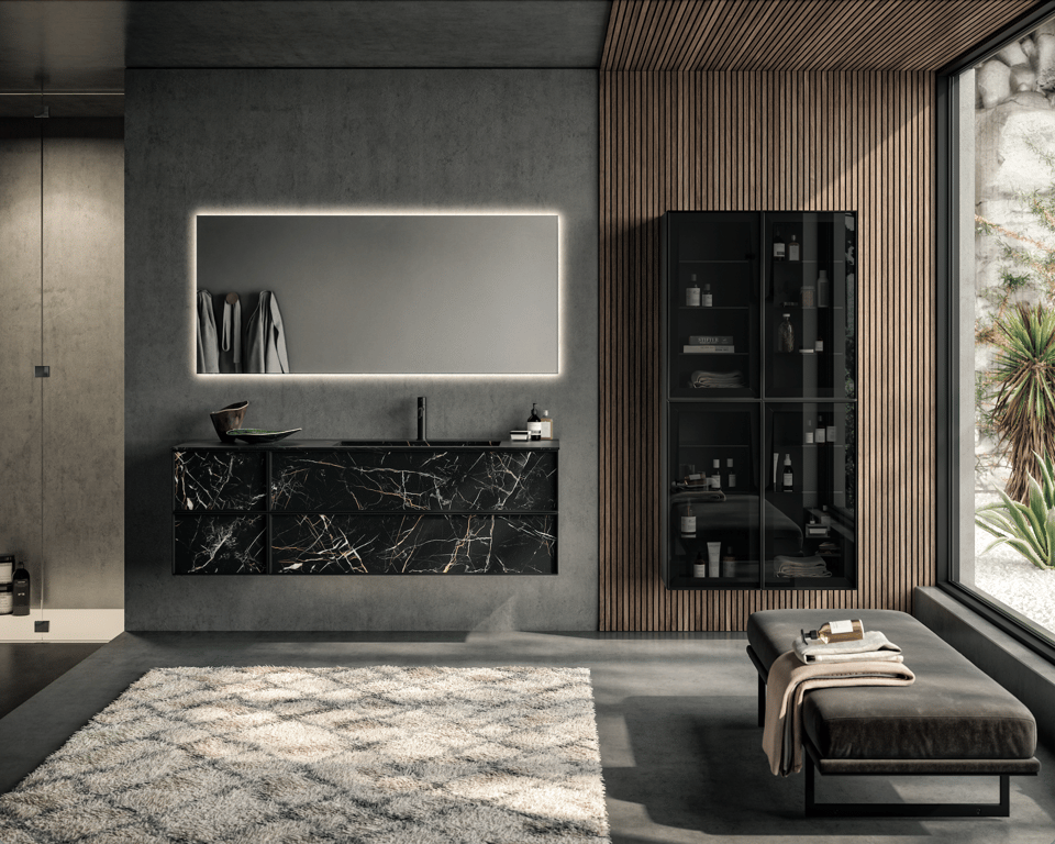
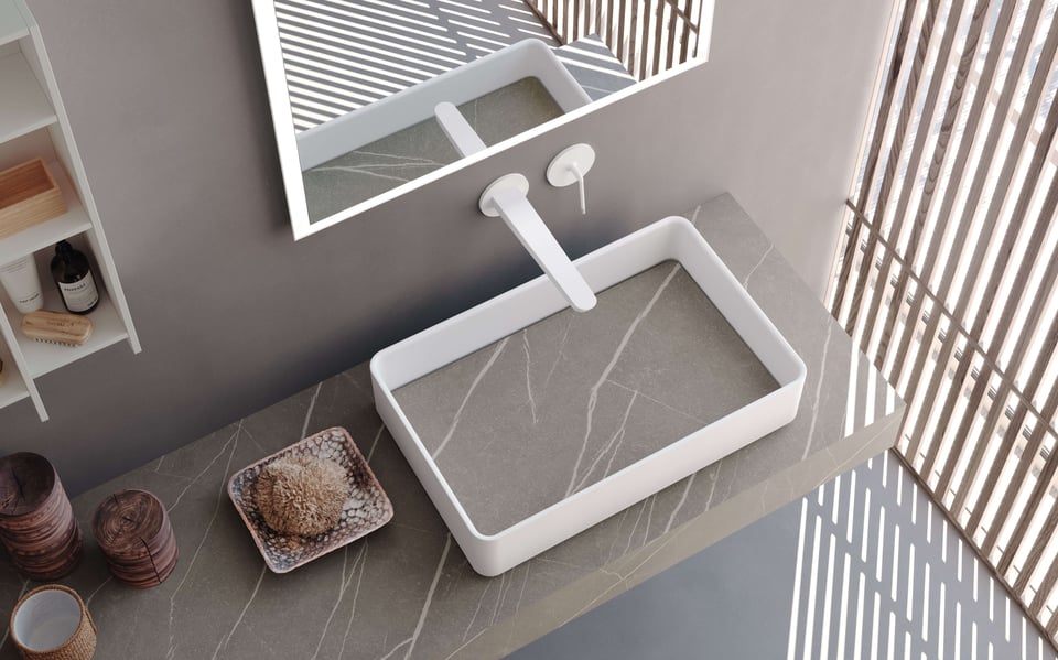
Of course, trends have evolved over five decades – olive green was the hottest shade of the 1970s, while today classic and sleek matte black is the top pick on people’s palettes. Yet regardless of trends, every VOLA color has been inspired by longevity and the bold, geometric principles of their founding values. The latest finish from VOLA is matte white – pure and minimal, it brings calmness, clarity and confidence.
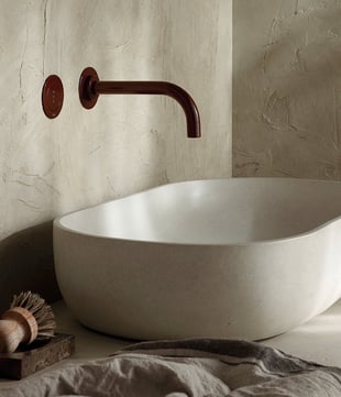
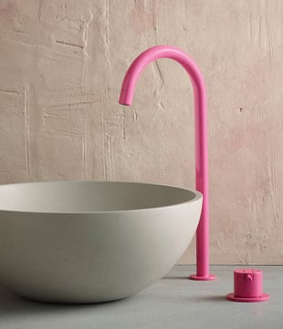
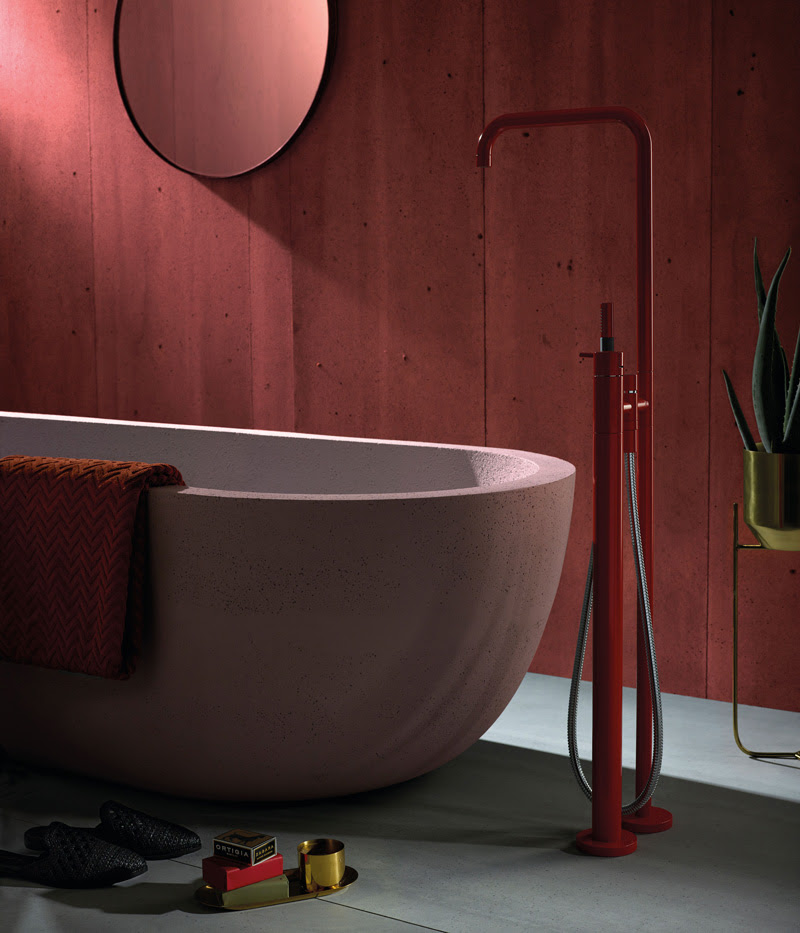
At the crossroads of art and science, color is an essential tool in any designer’s box. Whether it’s through harmony or collision, contrasting or complementing, color combinations affect our moods – uplift us, energize us, relax us, define who we are, or who we want to be. Our homes are a canvas for expression.
